We’ve refreshed the Pandora Community site to make it easier to connect, browse, and discover. ✨ Check out what's new here.
- Pandora Community
- :
- Support
- :
- Automotive
- :
- Useless buttons on Android Auto
- Subscribe to RSS Feed
- Mark Post as New
- Mark Post as Read
- Float this Post for Current User
- Bookmark
- Subscribe
- Mute
- Printer Friendly Page
- Mark as New
- Bookmark
- Subscribe
- Mute
- Subscribe to RSS Feed
- Permalink
- Report Inappropriate Content
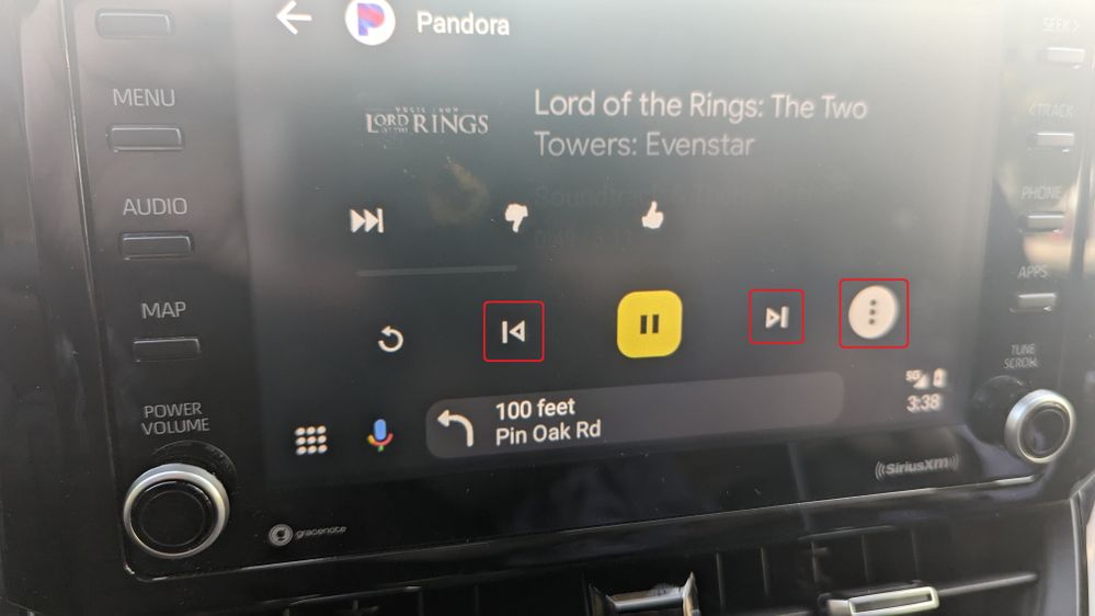
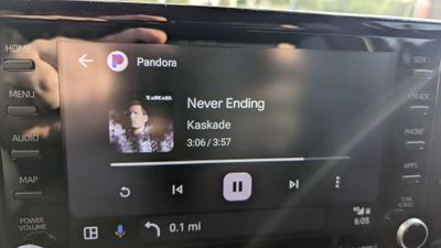
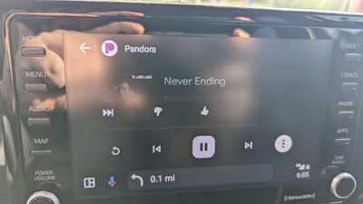
I outlined the useless buttons on Android Auto. It'd be nice if the buttons matched the layout on the phone app shown in the second image.
- Mark as New
- Bookmark
- Subscribe
- Mute
- Subscribe to RSS Feed
- Permalink
- Report Inappropriate Content
Strangely, sometimes the useless buttons vanish, and the buttons are displayed in the proper order matching the second image I added in the top post. I think the buttons show up on their own after the song changes, but I never really paid attention since I'm usually trying to go somewhere when I'm in my car.
- Mark as New
- Bookmark
- Subscribe
- Mute
- Subscribe to RSS Feed
- Permalink
- Report Inappropriate Content
I figured out why the normal buttons get messed up for me.
Using Android Auto, with Waze as navigation app, and Pandora as music app. Pandora buttons are fine until I set a destination in Waze.
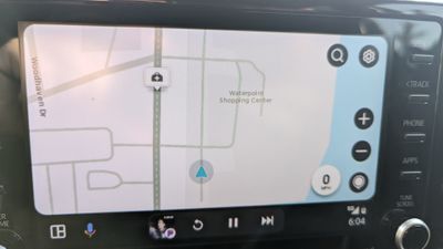
normal before navigation. Buttons below map have the return loop and double arrow skip button.
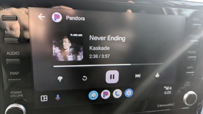
normal in Pandora app before navigation.
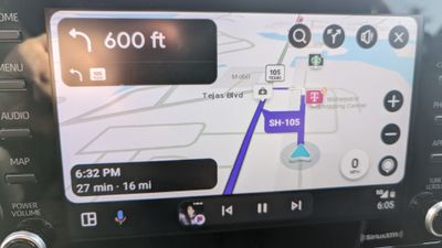
after navigation, buttons below map change to single arrow back button and single arrow forward button.
in Pandora after navigation, thumbs up and down and the double arrow skip button are missing. Replaced by the addition of a single arrow back, single arrow forward, and a "more options" button
missing buttons hidden in the "more options" menu
